


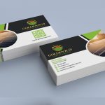


Your business card is more than just a piece of paper—it’s your first impression, your handshake, and your brand all in one small space. If you want to stand out, grab attention, and leave a lasting mark, you need a professional business card design that speaks for you.
Imagine handing someone a card that instantly builds trust and sparks interest. Ready to discover how the right design can open doors and grow your network? Keep reading to find out what makes a business card truly professional and how to get one that works perfectly for you.
Why Choose Professional Design
Choosing a professional business card design makes a strong first impression. A well-crafted card shows your business is serious and trustworthy. It helps your contact stand out in a pile of ordinary cards.
Professional design uses clear layouts and quality visuals. This makes your information easy to read and remember. A good design reflects your brand’s style and values clearly.
Clear Communication
A professional design organizes your contact details simply. It avoids clutter and confusion. People find it easy to understand who you are and what you do.
Builds Credibility
Your business card is a small but powerful marketing tool. A polished design tells clients you care about quality. It builds trust before a single word is spoken.
Unique And Memorable
Expert designers create cards that stand out. They use colors and fonts that match your brand. This helps people remember you after meetings.
High-quality Materials
Professional designs often pair with better card stock. Thick, smooth paper feels good to hold. This adds a sense of value to your business.
Consistent Branding
A pro design keeps your brand colors and fonts uniform. This consistency strengthens your business image. It makes you look organized and professional.
Elements Of Stunning Business Cards
Business cards are small but powerful tools. They create a strong first impression. Stunning business cards catch attention and stay memorable. Every detail counts. The right elements make cards look professional and clear.
Simple designs work best. Clear text, good colors, and quality material help. Let’s explore key elements that make business cards stand out.
Clear And Readable Typography
Text must be easy to read. Choose simple fonts that match your brand style. Use font sizes that work well on small cards. Avoid too many font styles. Keep the message clear and sharp.
Effective Use Of Color
Colors grab attention quickly. Pick colors that reflect your brand identity. Use contrasting colors for text and background. Balance bright colors with neutral tones. This keeps the card attractive but not overwhelming.
Quality Material And Finish
Paper quality shows professionalism. Thick, sturdy cards feel better in hand. Matte or glossy finishes add style and protect the card. Select a finish that fits your brand personality and budget.
Simple And Focused Layout
A clean layout helps information stand out. Avoid clutter or too many elements. Group related info and leave enough white space. This guides the reader’s eye smoothly across the card.
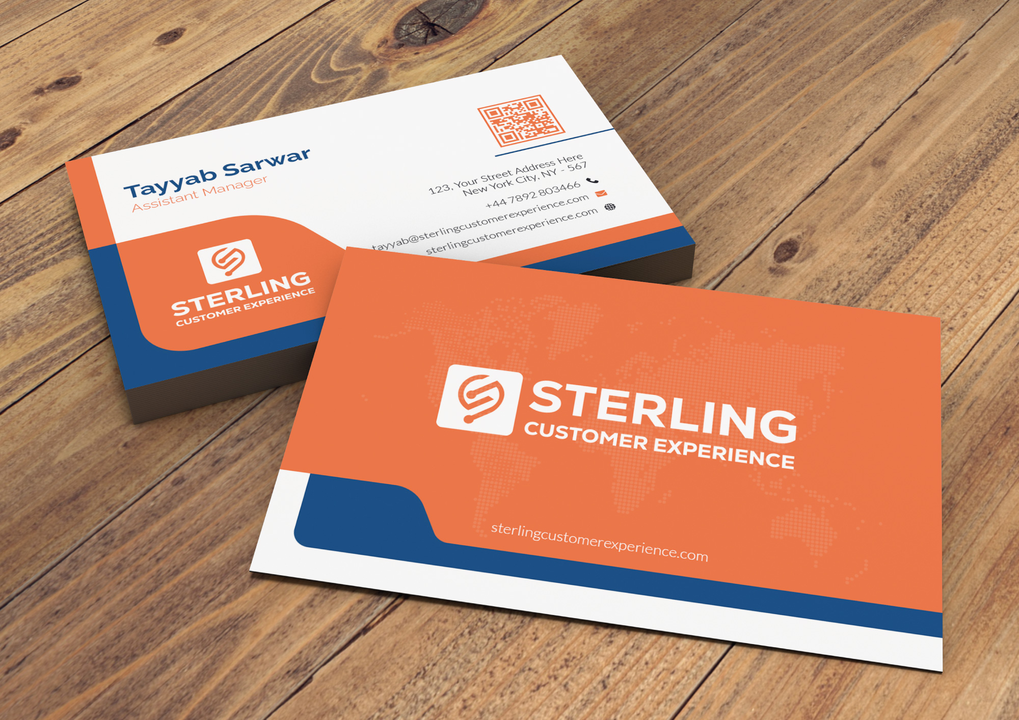
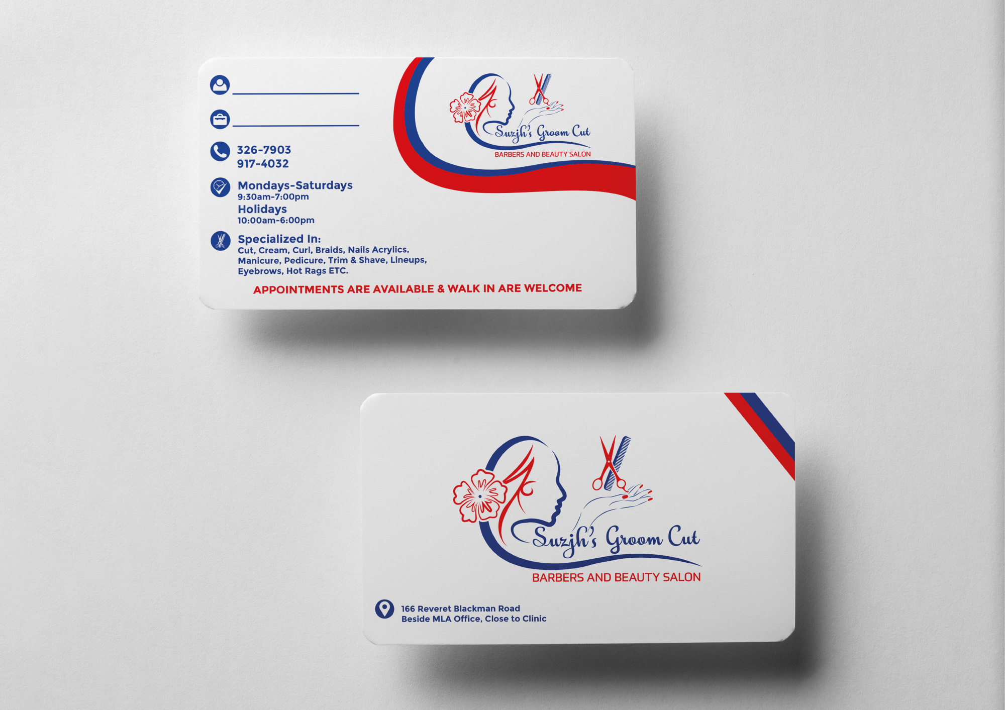
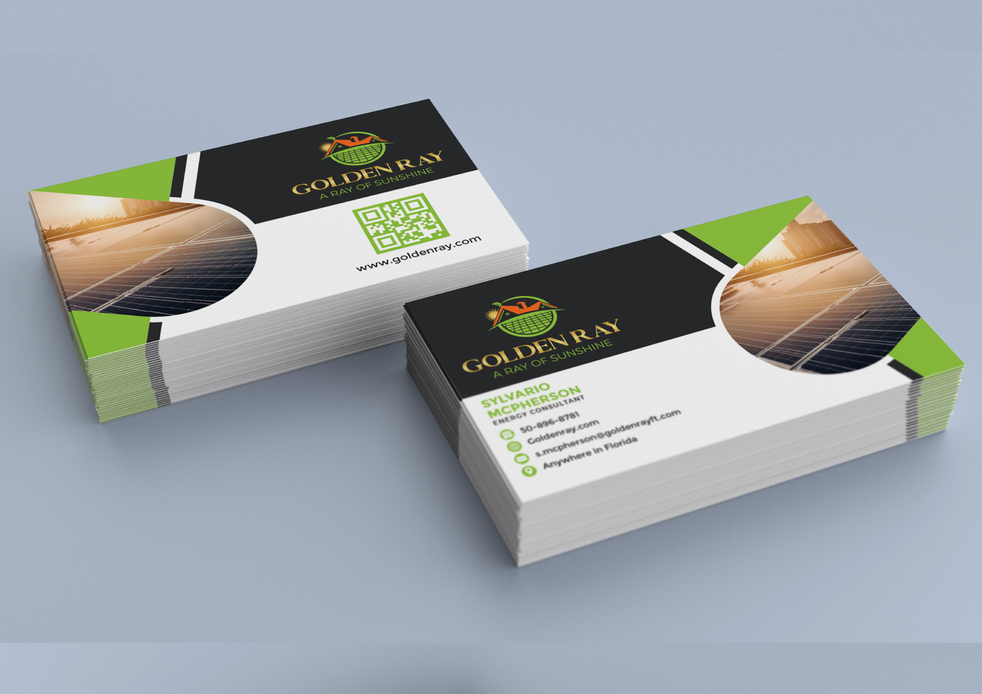
Memorable Logo Placement
The logo represents your brand. Place it where it’s easy to spot. Make sure it’s clear and not too big. A well-positioned logo boosts brand recognition.
Color Schemes That Impress
Color schemes play a big role in professional business card design. The right colors catch attention and make your card memorable. Colors also send messages about your brand and personality. Choosing the perfect palette helps you stand out in a stack of cards.
Colors create feelings and set moods. A well-chosen scheme shows your style and professionalism. It helps clients remember you and trust your business. Simple yet bold color choices impress and invite people to connect.
Understanding Color Psychology
Colors affect how people feel about your business. Blue means trust and calm. Red shows energy and passion. Green gives a sense of growth and health. Picking colors that match your brand values builds a strong image.
Choosing Colors That Match Your Industry
Every industry has colors that clients expect. A law firm might use dark blue or black for seriousness. A creative agency might use bright, lively colors for fun. Matching your industry helps clients understand your work quickly.
Combining Colors for Maximum Impact
Use two or three colors that work well together. Contrast helps important details stand out. Light backgrounds with dark text improve readability. Keep the palette simple to avoid confusion and clutter.
Typography Tips For Clarity
Typography plays a key role in making a business card easy to read. Clear text helps people remember your name and contact details. Choosing the right fonts and styles improves the card’s look and function.
Good typography guides the eye and creates a clean layout. It avoids clutter and confusion. Simple choices often lead to the best results for business cards.
Use Readable Fonts
Select fonts that are easy to read at small sizes. Sans-serif fonts like Arial or Helvetica work well. Avoid fancy or script fonts that blur when printed.
Limit Font Styles
Stick to one or two font styles. Too many styles make the card look messy. Use bold or italics only to highlight key information.
Choose Proper Font Size
Keep font sizes between 8 and 12 points. Smaller text is hard to read. Larger text helps important details stand out.
Maintain Good Spacing
Ensure enough space between letters and lines. Tight spacing makes reading difficult. Proper spacing creates a balanced and neat design.
Contrast Text And Background
Use colors that contrast well. Dark text on a light background is easiest to read. Avoid colors that blend or cause strain.
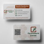
Incorporating Your Brand Identity
Incorporating your brand identity into a professional business card design helps create a strong first impression. It makes your card memorable and shows what your business stands for. Every element of the card should reflect your brand’s personality and values.
Consistent use of colors, logos, and fonts builds trust. It connects your card to your other marketing materials. This consistency helps people recognize your brand easily.
Using Brand Colors Effectively
Brand colors are a key part of your identity. Choose colors that represent your business mood. Use these colors on your card background, text, or accents. This makes your card visually linked to your brand.
Incorporating Your Logo
Your logo is the face of your business. Place it clearly on the card. It should be visible but not overpower the design. A well-placed logo boosts brand recall and professionalism.
Choosing Fonts That Match Your Brand
Fonts convey tone and style. Pick fonts that match your brand voice. Use simple, readable fonts for contact details. Keep font styles consistent across all cards.
Maintaining Brand Consistency
Consistency across all elements strengthens your brand image. Use the same design style, colors, and fonts. Make sure the card feels like part of your overall brand.
Choosing The Right Card Material
Choosing the right card material plays a big role in your business card’s impact. The material affects how your card feels and how others remember you. A good material shows professionalism and care. It also helps your card stand out in a pile. Different materials offer different textures and durability. Picking the right one depends on your style and business type.
Paper Stock
Paper stock is the most common choice for business cards. It feels smooth or textured, depending on the finish. Thick paper stock looks strong and lasts longer. You can choose from matte or glossy finishes. Matte gives a soft look. Glossy makes colors pop. Paper cards are easy to print and affordable.
Plastic Cards
Plastic cards are sturdy and waterproof. They resist bending and tearing better than paper. These cards feel modern and sleek. Clear or frosted plastic adds a unique touch. Plastic cards work well for creative or tech businesses. They last long and leave a strong impression.
Textured Materials
Textured materials create a special feel for your card. Linen and cotton blends add a fabric-like touch. Embossed or raised textures highlight your logo or name. These cards feel premium and upscale. Textures make your card easy to remember and touch. They suit luxury brands and creative fields.
Recycled Materials
Recycled materials show your care for the environment. These cards use eco-friendly paper or fibers. They often have a natural, rough look. Choosing recycled cards sends a green message. They appeal to customers who value sustainability. Recycled cards combine style with responsibility.
Creative Shapes And Sizes
Creative shapes and sizes make business cards stand out from the crowd. They catch attention quickly. A unique shape or size can reflect your brand’s personality. These cards do more than just share contact details. They create a lasting first impression.
Choosing the right shape or size can highlight your creativity. It shows you care about details. Creative business cards often get saved and shared. This means more people remember your brand.
Custom Die-cut Shapes
Custom die-cut shapes allow you to break the usual rectangle mold. Cards can be circles, squares, or even logos. This adds a fun and personal touch. They make your card memorable and different. This design style fits many business types.
Mini And Square Sizes
Mini cards are small but powerful. They fit easily in wallets or pockets. Square cards offer a modern, clean look. Both sizes attract attention because they differ from the norm. They are simple yet effective for sharing your info.
Folded Business Cards
Folded cards offer extra space for details or images. They look like tiny brochures. This format gives room to explain your services. Folded cards feel special and give a premium vibe. They work well for creative industries.
The Role Of White Space
White space is the empty area around text and images on a business card. It helps to make the card look clean and easy to read. Without white space, the card can feel crowded and confusing.
Using white space well guides the viewer’s eye to the important information. It creates balance and highlights key details like your name or contact info. White space is not wasted space. It is a powerful design tool.
The Importance Of Clear Focus
White space helps focus attention on what matters most. It separates different sections and prevents clutter. This makes your card easier to scan and remember.
Creating A Professional Look
A good amount of white space gives a card a clean, modern look. It shows that you pay attention to detail and value quality. This builds trust with potential clients.
Improving Readability
White space makes text easier to read. It reduces eye strain and helps the viewer absorb information faster. Clear text and space work together for better communication.
Balancing Text And Images
White space balances logos, text, and other design elements. It stops the card from feeling too busy or too empty. A balanced card looks more inviting and professional.
Printing Techniques That Pop
Choosing the right printing technique makes your business card stand out. It adds texture, color, and style that catch the eye. The feel and look of a card can leave a strong impression on clients.
Different printing methods give different effects. Some add shine, some add depth, and some create a unique touch. Understanding these techniques helps you pick the best design for your brand.
Embossing And Debossing
Embossing raises parts of your card design above the surface. It creates a 3D effect that feels nice to touch. Debossing pushes the design into the card, making an indented look. Both add a classy, professional feel to your card.
Spot Uv Coating
Spot UV adds a glossy shine to specific parts of your card. It highlights logos, text, or images. The contrast between matte and shiny areas makes the card visually exciting. This technique gives a modern and clean look.
Foil Stamping
Foil stamping uses metallic foil to add shine and color. Gold, silver, or other colors can make your card look elegant. The foil reflects light, creating a bright and attractive finish. This method suits luxury or high-end brands well.
Letterpress Printing
Letterpress presses ink into thick paper, making a deep impression. It offers a tactile feel and vintage look. This technique adds texture and weight to your card. It works great for simple, bold designs.
Thermography
Thermography creates raised ink by heating powder on wet ink. It looks like embossing but costs less. The raised texture adds a subtle 3D effect. It is perfect for clear text and logos.
Common Mistakes To Avoid
Buying a professional business card design needs careful thought. Avoiding common mistakes can save time and money. It also helps make a strong impression on clients and partners.
Many people focus only on looks and forget key details. Some designs look nice but fail to share important information. Others use hard-to-read fonts or bad colors. These errors reduce the card’s value and hurt your brand.
Incorrect Contact Information
Check all phone numbers, emails, and addresses carefully. Wrong or missing details stop people from reaching you. Double-check every line before printing to avoid costly mistakes.
Poor Font Choices
Use simple fonts that are easy to read. Avoid fancy or tiny letters that strain the eyes. Clear text helps people remember your name and business quickly.
Overcrowded Design
Less is more on business cards. Too many words or images confuse the reader. Keep space around text and logos for a neat look. This makes your card look professional and clean.
Ignoring Brand Colors
Match your business card colors with your brand palette. Wrong colors weaken your brand message. Consistent colors build trust and make your card memorable.
Low-quality Printing
Choose high-quality paper and printing methods. Cheap prints fade or tear easily. Good materials show you care about your business and clients.
How To Work With Designers
Working with a professional designer can improve your business card greatly. Clear communication and simple steps help. Follow these tips to get the best design experience.
Provide Clear Information
Share your business name, logo, and contact details. Tell the designer your color preferences and style ideas. The clearer your input, the better the design.
Set Realistic Expectations
Understand the designer’s process and timeline. Give enough time for drafts and revisions. Patience leads to a polished final product.
Give Constructive Feedback
Be specific about what you like or want changed. Use simple language to explain your points. Good feedback helps the designer improve your card fast.
Trust The Designer’s Expertise
Listen to the designer’s advice on fonts, colors, and layout. They know what works best for print and style. Trust builds a better design partnership.
Maximizing Business Card Impact
Business cards remain a powerful tool for first impressions. A well-designed card can catch attention and leave a mark. Maximizing the impact of your business card helps you stand out in a crowded market.
Every detail counts. From the font to the layout, each element shapes how others see your brand. Professional design ensures your card looks sharp, clear, and memorable.
Clear And Simple Design
Keep the design clean. Avoid clutter and too many colors. Use readable fonts and enough white space. This helps people quickly find your name and contact details.
Quality Materials
Choose thick, sturdy paper for your cards. Good quality feels better and lasts longer. Matte or glossy finishes add a nice touch. These details make your card feel professional.
Consistent Branding
Match your card’s style with your brand. Use your logo, brand colors, and fonts. This builds trust and makes your brand easy to recognize. Consistency across materials is key.
Include Essential Information
List only the most important contact details. Your name, job title, phone number, and email are musts. A website or social media link can be added. Avoid overcrowding the card with too much text.
Unique Touches
Small design features can make a big difference. Rounded corners, embossed text, or a spot UV finish add style. These touches catch the eye and make your card stand out.
Frequently Asked Questions
What Is Professional Business Card Design?
A professional business card design shows your brand clearly and looks attractive to others.
Why Should I Buy A Business Card Design?
A good design helps people remember you and makes your business appear trustworthy.
How Much Does A Professional Business Card Design Cost?
Prices vary, but most designs range from $20 to $150 depending on details.
What Information Should Be On My Business Card?
Include your name, job title, phone, email, and company logo or name.
Can I Customize My Business Card Design?
Yes, most designers offer options to change colors, fonts, and layout.
How Long Does It Take To Get A Business Card Design?
Designs usually take 1 to 5 days depending on complexity and revisions.
What File Formats Will I Receive For Printing?
You will get high-quality files like PDF, JPG, or PNG for printing.
Should My Business Card Match My Website Style?
Matching style creates a strong brand and makes your business look professional.
Can A Professional Design Improve Networking Success?
Yes, a clear and neat card makes a good impression and helps people connect.
Where Can I Print My Professional Business Cards?
You can print locally or use online printing services for quick delivery.
Conclusion
A professional business card helps you make a strong first impression. It shows your style and attention to detail. A well-designed card makes it easy for others to remember you. Choose a design that fits your brand and personality. Quality materials and clear information matter a lot.
Your card can open doors to new opportunities. Invest in a design that you feel proud to share. Simple, clean, and professional works best every time. Don’t miss the chance to stand out with your business card.


Blue Door Living –
Byzenta did a great job with our business cards and email signatures. He was fast, effective, and very kind. I would hire him again to do work like this. He was much faster than I expected, and did not complain when I had multiple revision requests. I really recommended him
Jacob William –
This is my second project with this creator. His communication is great. He is quick to respond and does a great job making changes. I feel like he understood what I was looking for exceptionally well.